SEALED AIR DESIGN SYSTEM
Designed and implemented a scalable system for consistent, accessible experiences across global platforms.
OVERVIEW:
This case study highlights the successful implementation of a global design system at Sealed Air, a B2B leader in packaging and automation solutions. As Lead UX Designer, I led the end-to-end creation of a scalable system. Our goal was to enhance usability across all digital touchpoints, streamline component development in Adobe Experience Manager (AEM), and empower content authors with clear usage standards.
Through a complete audit, redesign, and system rollout, we significantly improved design consistency, reduced production timelines, and equipped internal teams with the tools they needed to create better user experiences—faster.
Client: Sealed Air | Industry: B2B, Automation, Food & Protective Packaging, Technical Services, Global Commerce
Role: Lead UX Designer
Tools: Figma, Adobe Experience Manager (AEM), Jira Confluence
Tools Used: Figma, Miro, Jira

OBJECTIVES:
Standardize UI components across a fragmented ecosystem of global sites
Reduce design and development duplication through reusable design tokens and modules
Build responsive templates aligned with AEM authoring behavior
Create a shared design language rooted in Polaris for scalability and accessibility
Enable marketing and product teams to independently build consistent pages
Approach:
We began with a comprehensive UI audit and stakeholder interviews across product, marketing, and engineering. Drawing inspiration from Polaris and atomic design methodology, we created a foundational system in Figma that connected seamlessly with AEM component development.
The system was designed to support multiple brands, devices, and languages—while ensuring accessibility compliance and clear authoring guidelines.
WHAT WE BUILT:
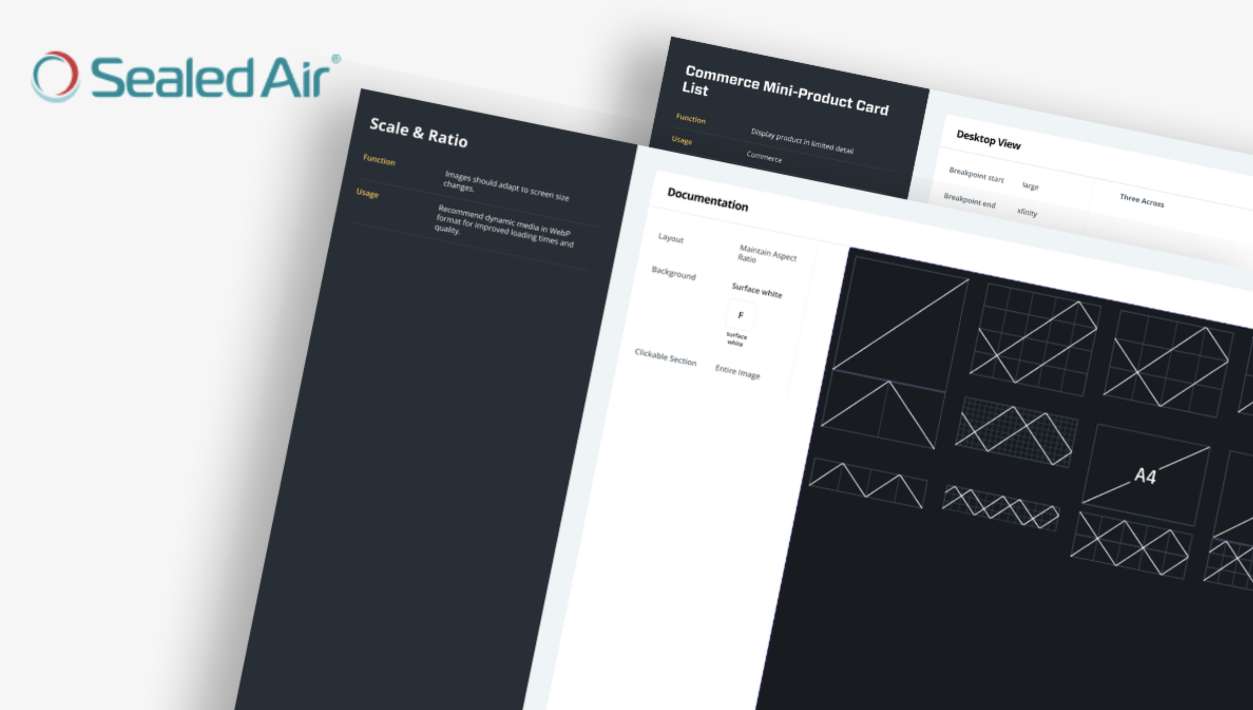
Design Tokens
Created a robust system of design tokens for consistency across teams and platforms:
Color system: Brand palettes + semantic states (success, warning, error)
Type styles: Modular type scale for web and mobile
Spacing & layout: 4pt grid and consistent spacing rules
Other tokens: Shadows, radii, and motion
These tokens were mapped directly to front-end styles for AEM compatibility.
Reusable UI Components
Built 40+ flexible, responsive components in Figma using auto layout and variants:
Buttons (primary, secondary, with/without icons)
Form elements with full states and validations
Navigation systems (global, local, mobile)
Content cards, alerts, data tables, banners
Accessibility baked in—ARIA labels, contrast, focus states
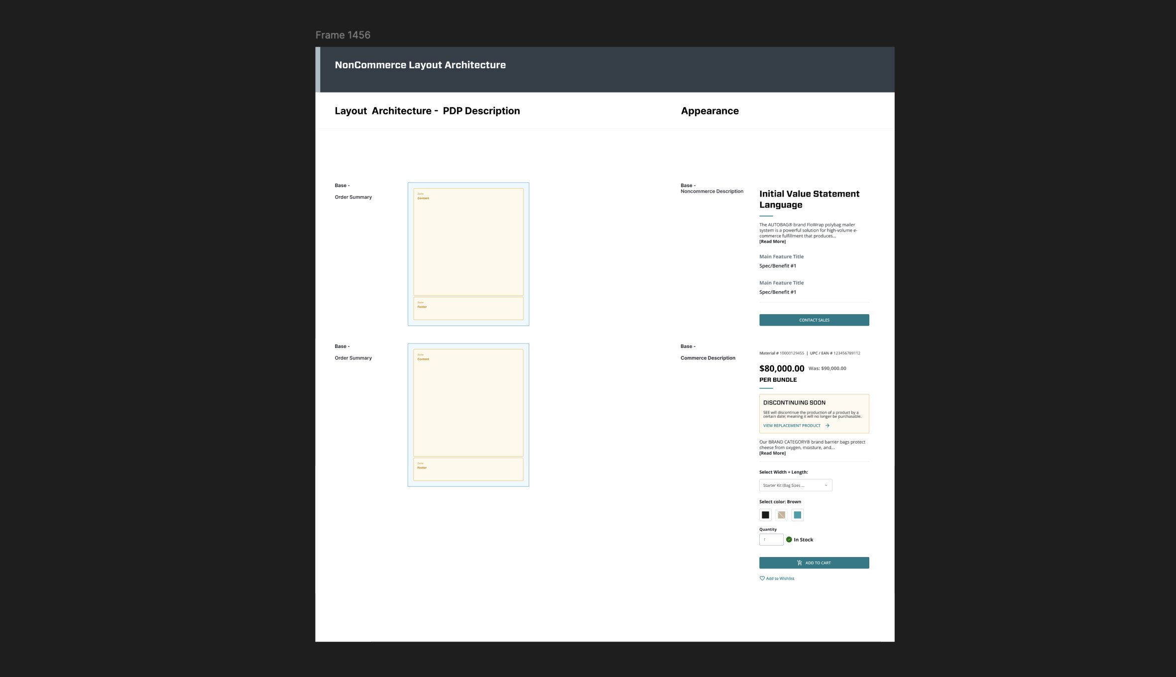
Templates & Layout Systems
Developed modular templates for homepage, landing pages, product details, and internal content pages:
Grid-based and auto-layout ready
Defined breakpoints for seamless responsive behavior
Page-building “blocks” that directly mirror AEM content modules
AEM Integration & Handoff Strategy
We focused heavily on making the system developer-friendly:
BEM-style naming for Figma layers to match CSS class structure
Figma Inspect and Zeplin exports for every component
Jira ticket linking to Figma source with usage notes and states
Clear authoring guidance for marketing and regional teams
Documentation & Governance
Built a living documentation system in Confluence:
Usage rules, visual examples, accessibility checks
Component version history and change logs
Contribution model for new requests and roadmap updates
RESULTS
25% increase in usability scores across key task flows
60% reduction in average page build time
Achieved WCAG 2.1 AA accessibility compliance across all new builds
Empowered content authors to create consistent pages without developer support
Delivered a scalable design system ready for future product and regional rollouts